Key Takeaways
- Veined countertops feel timeless when the pattern works with the kitchen’s palette rather than against it, regardless of what is trending in any given year.
- The variables that separate a lasting choice from a dated one are vein scale, vein colour contrast, background tone, and how the pattern reads at the viewing distance of a Singapore open-plan kitchen.
- Fine-to-medium veining in a warm neutral background tends to age better than high-contrast bold veining in a trend-specific colourway.
- Stone-look engineered surfaces now replicate the visual quality of natural marble veining accurately enough that the timelessness question applies equally to quartz and sintered stone patterns as it does to natural marble.
- Viewing a full slab in your kitchen’s actual light conditions, not a sample tile in a showroom, is the only reliable way to confirm a veined pattern will age well in your specific space.
Introduction
The bold veined marble countertop has been one of the most consistent renovation goals in Singapore kitchens for the past several years. The visual reference appears across Pinterest boards, renovation consultations, and showroom mood boards with a frequency that makes it feel like a settled design choice rather than a trend.
But veined countertops occupy an unusual position in interior design. Marble veining as a pattern category has been used in interiors for centuries. Specific expressions of that pattern, particular colourways, vein scales, and background tones, come in and out of favour on a much shorter cycle. A kitchen that installs the right veined surface for the next decade looks distinctly different from one that installs the version most popular on social media in the year of renovation.
This blog maps the difference between the two. It covers which veining characteristics tend to stay visually relevant across time, which ones are likely to feel dated within five to seven years, and how to evaluate a veined pattern against your specific kitchen conditions rather than against what looks compelling in a showroom photograph.
What Are Veined Countertops?
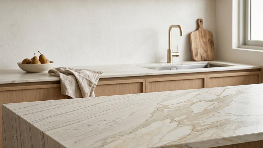
Veined countertops are surfaces that carry linear or branching pattern elements running through the slab material, replicating the visual character of natural marble, quartzite, granite, or other geological formations. In natural stone, veining is produced by mineral deposits or fractures that occurred during the stone’s formation. In engineered and sintered stone surfaces, veining is produced through digital printing and surface texturing techniques at the manufacturing stage. Both categories are available in a wide range of vein scales, colours, and background tones, from the fine grey veining of classic Carrara marble to the dramatic gold-and-white movement of Calacatta Oro.
What Makes a Veined Pattern Feel Timeless vs Trend-Dependent
The question of timelessness in veined countertops is not really about material. A natural marble slab and a high-quality stone-look surface in the same pattern will both age the same way aesthetically, because the pattern itself is what drives the perception of timelessness, not the substrate it’s printed or formed on. The factors that determine whether a veined pattern ages well are the same regardless of material.
Vein scale is the first variable. Fine, hair-thin veining distributed across the slab surface produces a surface that reads as textured and natural without calling attention to any individual pattern element. This scale of veining integrates with a wide range of cabinet colours and design directions. Bold, sweeping veins that run the full slab width in a single dramatic gesture are a design statement that works well in a specific composition but is harder to live with as design directions shift over years. The most dramatic veining expressions, where the veins are 30 to 50mm wide and occupy significant slab area, are the ones most likely to feel dated within a decade.
Background tone is the second variable. Warm neutral backgrounds, including warm whites, creams, soft beiges, and warm greys, integrate with the widest range of design contexts and hold their relevance across design cycles. Cool stark whites and pure bright whites have narrowed and expanded in popularity through distinct design cycles. A countertop specified in a background tone that is at peak popularity in any given year carries a higher risk of feeling dated as that cycle passes. As Ideal Home’s guide to kitchen worktop trends notes, earthy tones are now displacing the cooler greys and whites that dominated kitchen design for much of the preceding decade, and surfaces specified in those cold-toned palettes now read as dated in a way that warm neutral veined surfaces from the same period do not.
Vein colour contrast is the third variable. Low-to-medium contrast veining, where the vein colour is a deeper or slightly different tone of the background, reads as organic and natural. High-contrast veining, where a dramatically different vein colour cuts across the background, produces a more graphic and attention-demanding pattern. The most extreme high-contrast expressions, including gold veins on white backgrounds, black veins on bright white, or burgundy veins on cream, are compelling when they’re fresh and can read as dated more quickly than their subtler counterparts. That said, some high-contrast expressions, such as Calacatta-family patterns with grey veining on warm white, have demonstrated consistent relevance over a long design period. The vein colour’s relationship to natural stone is a meaningful signal: veining that replicates a recognisable geological process tends to age better than veining that introduces a colour specifically to follow a trend.
Pattern directionality is the fourth variable. Directional veining, where the veins flow predominantly along one axis, produces a surface that is visually ordered and easy to live with over time. Multi-directional or dispersed veining, where the pattern moves in multiple directions across the slab, produces a more active and complex visual that can feel dynamic when installed and demanding to live with as the kitchen ages. For most homeowners choosing natural stone products that they will be using daily for a decade or more, directional veining is the lower-risk specification.
“Marble worktops are a versatile neutral choice. A veined stone with a large-scale pattern adds drama and depth while remaining a stylish solution for those who want a primarily neutral kitchen aesthetic.” (Ideal Home, Kitchen Worktop Trends)
The Most Durable Veined Pattern Categories
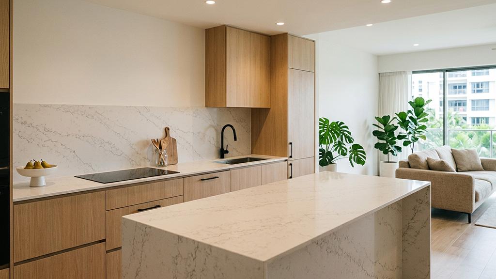
Not all veined pattern families age at the same rate. Some have demonstrated cross-decade relevance; others are tied strongly to a specific design moment.
Carrara-Family Patterns
Carrara marble, with its soft grey veining on a warm white background, has been used in interiors continuously since the Renaissance. The pattern category is now widely available in quartz and sintered stone versions. Carrara-family veining ages well because the grey vein colour is not trend-specific, the background tone is warm rather than cool, and the fine-to-medium vein scale does not demand attention from across the room. In Singapore, open-plan kitchens where the countertop is visible from the living zone, a Carrara-family veined surface reads as settled and considered rather than trend-chasing.
Calacatta-Family Patterns
Calacatta veining is bolder and more dramatic than Carrara, with larger veins, more variation in vein width, and a whiter, brighter background. The classic grey Calacatta expressions have also demonstrated sustained relevance. Where the timelessness question arises is in the more saturated Calacatta variants: gold Calacatta (with warm gold veining), viola Calacatta (with purple or burgundy veining), and emerald Calacatta (with green veining). These expressions are compelling within their design moment but carry higher trend-dependency risk over a 10-to-15-year kitchen lifespan. Grey Calacatta ages well. Gold and coloured Calacatta variants carry a trend risk that the homeowner should weigh against the length of time the kitchen is expected to remain in its current form.
Travertine and Limestone Patterns
Travertine and limestone-effect veining, with its warm buff, beige, and sand tones, is one of the most enduring pattern categories in residential interiors. The veining character in these stones is more organic and less dramatic than marble-family patterns: horizontal layering, subtle tonal variation, and a surface that reads as natural material rather than a graphic pattern. In sintered stone versus marble for Singapore surface applications, travertine-effect patterns in honed finishes are among the most consistently relevant surface choices across changing design cycles. They work with warm wood tones, neutral cabinetry, contemporary hardware, and traditional kitchen schemes without requiring the rest of the kitchen to adapt to them.
Dark-Veined Surfaces
Dark-toned veined surfaces, including dark grey, near-black, and deep brown-veined stones, have demonstrated consistent relevance in premium kitchen design. The aesthetic case is different from light-toned veining: a dark-veined countertop reads as architectural and grounding rather than soft and organic. It works best in kitchens with enough natural or artificial light to prevent the surface from reading as a void. In Singapore’s typically well-lit condominiums, dark-veined surfaces in a honed finish hold up well over time because the pattern recedes slightly, letting the tone do the design work.
Viewing Distance and Singapore Kitchen Scale
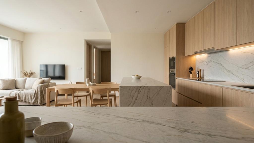
One variable that most veined countertop content ignores entirely is viewing distance. A pattern that looks perfect in a showroom at arm’s length behaves very differently when it’s installed in a Singapore open-plan kitchen where the countertop is viewed from the living and dining area, a distance of four to six metres or more.
At close range, fine veining has detail and movement. At six metres, that same fine veining compresses into a tonal wash. What reads as beautifully detailed in a sample showroom may simply read as a grey or beige surface from across the room. Bold, large-scale veining, conversely, reads well at distance because the individual vein lines are visible as pattern elements from across the open-plan zone. Whether that long-range reading enhances or overwhelms the kitchen depends on how much of the surrounding design can carry that level of activity.
As Houzz Singapore’s countertop selection guide notes, homeowners frequently find that surfaces look different in their kitchen from how they appeared in a showroom, because showrooms use different lighting and present surfaces in isolation rather than in the context of an installed kitchen. Viewing a large-format slab sample in your actual kitchen, under your installed lighting and against your cabinetry, is the single most reliable step in the veined pattern selection process.
“What I’ve realised through this process is that there really isn’t a single best option. It all comes down to how you live, how you use your kitchen, and what balance you want to strike between practicality and aesthetics.” (Ideal Home, Kitchen Chronicles)
How Stone-Look Surfaces Handle the Timelessness Question
The timelessness evaluation applies to stone-look veined surfaces exactly as it applies to natural stone. A quartz or sintered stone slab replicating Carrara veining in warm grey on a warm white background will age with the same relevance as a natural Carrara marble slab carrying the same visual character. The pattern is the variable; the material substrate is not.
Where stone-look surfaces offer a practical advantage for Singapore kitchens is maintenance consistency. A natural marble slab will age visually through use, developing the patina, etching, and subtle darkening that come with daily food preparation contact. That ageing can read as character or as deterioration depending on the homeowner’s perspective and the maintenance level applied. A veined sintered stone or quartz surface in the same pattern maintains its surface condition regardless of use, which means the pattern you choose at installation is the pattern the kitchen carries ten years later. For homeowners making a 10-to-15-year pattern commitment, that consistency is a meaningful advantage.
The timelessness assessment for stone-look veined surfaces: Carrara and travertine-family patterns in honed or matte finishes are the strongest long-term choices. Classic Calacatta grey veining is strong. Bold gold, coloured, or high-contrast Calacatta variants carry higher trend-dependency risk. Dark-toned veined surfaces in honed finishes are durable choices for the right kitchen.
Practical Steps for Evaluating a Veined Pattern
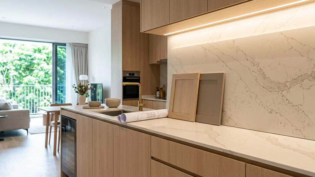
View the full slab, not a sample tile. A 100mm sample tile cannot show how a veined pattern distributes across 3 metres of countertop. The full slab reveals whether the veining is concentrated in one section, whether it includes areas of very high movement next to quieter sections, and whether the overall character is consistent enough to work across a kitchen run.
Bring the slab into proximity with your cabinet colour. The single most common mistake in veined countertop selection is choosing a pattern in isolation. Place a large slab section against your actual cabinet door sample, in your kitchen under your installed lighting, and assess whether the vein colour and background tone relate correctly to the cabinetry.
Assess the pattern at both close range and from the living zone. Stand at the counter and evaluate the detail. Then stand at the position you occupy most often when the kitchen is in view from the living or dining area, and assess how the pattern reads from that distance. If the pattern is visible and considered from both positions, it will hold up well in daily life.
Ask yourself whether the vein colour refers to a specific design moment. If the vein colour is one that became fashionable within the past two to three years, that’s worth pausing on. Veining that replicates a natural geological process, grey, warm white, cream, soft brown, buff, or black, carries less trend-dependency than veining that introduces a colour specifically associated with a recent design cycle.
FAQS
1. Are veined countertops timeless or trendy?
Veined countertops as a category are enduring. Natural marble veining has been a constant in interior design for centuries. Specific expressions of veined patterns carry different levels of trend-dependency. Carrara-family and travertine-family patterns with warm neutral backgrounds are the most consistently relevant. Bold coloured veining or very high-contrast patterns carry higher trend risk over a 10-to-15-year kitchen lifespan.
2. What veined pattern looks best in Singapore kitchens?
Carrara-family patterns in warm white or light grey backgrounds suit the widest range of Singapore kitchen designs, from contemporary to transitional. Travertine-effect patterns work particularly well in Japandi and warm minimalist kitchens. Dark-toned veined surfaces suit kitchens with strong natural light and warm surrounding materials. The countertop colours that age best in Singapore’s LED-lit open-plan kitchens are warm neutrals rather than cool or stark tones.
3. Is natural stone veining more timeless than stone-look veining?
The timelessness of a veined pattern is determined by the pattern characteristics, not by whether the surface is natural stone or engineered. A Carrara-effect quartz in a warm white background will age as well as aesthetically as natural Carrara marble in the same visual family. The practical difference is that natural stone’s surface changes with use while engineered surfaces maintain their original condition, which affects how the pattern reads after a decade of daily use.
4. How do I know if a veined countertop pattern will still look good in ten years?
The most reliable evaluation is whether the pattern elements, vein scale, vein colour, and background tone refer to a timeless natural material or to a specific design moment. Fine-to-medium grey veining on a warm neutral background has demonstrated relevance across multiple design cycles. Very high-contrast veining in a trend-specific colourway is harder to evaluate with confidence. Viewing the pattern in context, in your kitchen under your lighting conditions, is a more reliable test than showroom evaluation.
5. Should the veining in my countertop match my backsplash?
Not necessarily match, but relate. A veined countertop that continues the same veining character into the backsplash creates visual continuity that suits contemporary and minimalist Singapore kitchens. A veined countertop paired with a contrasting backsplash material, such as a plain tile or a concrete-effect panel, allows the countertop pattern to read as the primary design element without competition. Both approaches work. What doesn’t work is a backsplash that introduces a competing pattern of equal visual weight, which divides the eye’s attention and makes both surfaces look busier than they would individually.
Conclusion
Veined countertops are one of the most satisfying renovation choices when the pattern is selected with a clear understanding of how it will read in daily life over many years. The pattern that photographs beautifully in a showroom and the pattern that you’ll still find compelling after a decade of daily use are sometimes the same surface, and sometimes they are not. Knowing which variables produce long-term relevance, rather than short-term visual impact, is what separates a countertop decision that ages well from one that feels dated sooner than expected.
TSD supplies and fabricates veined surfaces across the full range of natural stone and engineered stone materials, in every finish and pattern family relevant to Singapore kitchens. If you want to see full slab samples of specific veined patterns under your kitchen’s actual conditions, visit the showroom at 16 Joo Koon Circle, call +65 6908 5147, or email tsd.enquiry@gmail.com.