Key Takeaways
- A statement kitchen island earns its place when the surface makes the island a visual anchor without destabilising the rest of the kitchen.
- The most common mistake is confusing drama with loudness. The strongest island surfaces carry clear character without competing with every other element in the room.
- Veining scale, finish type, and tone depth all affect how much visual weight a surface adds. Each of these variables can be dialled up or down independently.
- In Singapore’s open-plan condo and HDB kitchens, the island surface is visible from the living and dining zone. Surfaces that read well at close range and from across the room behave differently.
- The perimeter countertop and the island surface do not need to match, but they must relate. The relationship between the two determines whether the kitchen reads as considered or confused.
Introduction
Most kitchen islands make a statement through cabinet colour or form. A dark painted base in a light kitchen. An unusual shape. Open shelving instead of doors. The surface material is typically chosen last, selected to match or contrast what’s already been decided rather than as a deliberate design decision in its own right.
That sequence works for functional kitchens. It doesn’t work as well for a statement kitchen island, where the surface is one of the most visible elements in the room and, in Singapore’s open-plan layouts, one of the first things a visitor sees when they enter the space. A surface chosen as an afterthought often reads like one.
This blog takes the opposite approach. It treats the island surface as the starting point for the statement and works outward from there. Which surface characters are strong enough to anchor a kitchen without dominating it, which finishes add presence without adding noise, and which design variables allow the statement to be calibrated rather than committed to blindly.
What Makes a Kitchen Island a Statement Island?
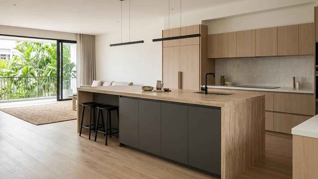
A statement kitchen island is an island where a deliberate design choice creates a focal point in the kitchen. The statement can come from the cabinet colour, the island form, the edge profile, or the surface material. Often it comes from two or three of these working together. What distinguishes a statement island from a decorated one is intentionality: every visible element has been chosen because it contributes to a single impression rather than because it was available.
The surface material is the most durable component of that statement. Cabinet paint can be refreshed. An island shape can be replaced in a renovation. The stone surface, once installed and sealed to the cabinet, is the element the kitchen will carry for ten to twenty years. As Ideal Home notes in its kitchen island design guide, the question of whether to match the island surface to the perimeter countertop or to make a deliberate contrast is one of the first decisions that shapes how the kitchen reads as a whole.
The Risk of Getting It Wrong
The failure mode of a statement kitchen island is not subtle. It’s excess. A surface with too much veining movement, specified in a polished finish, on an island positioned in front of neutral cabinetry, becomes the only thing a person looks at when they enter the kitchen. The island dominates rather than anchors. Every other element in the room recedes, not because it is understated, but because the island has claimed all the available visual attention.
This is the problem the blog title points at. Not “how do I make a statement” but “how do I make a statement without overwhelming.” The surface that answers that question is one with enough character to be interesting, controlled enough to stay in its role as a focal point rather than a distraction.
“When designing a kitchen island, you need to think about what material to use on the counter. Do you want to maintain cohesion by selecting a material that matches the rest of the kitchen run? Or do you want to make a statement with something more distinctive?” (Ideal Home, Kitchen Island Ideas)
The Variables That Determine Visual Weight
Understanding how much visual weight a surface adds is a matter of reading four independent variables: veining scale, tone depth, finish type, and pattern movement. Each can be adjusted without touching the others, which means a statement island surface is a calibration exercise rather than a binary choice between plain and dramatic.
Veining scale refers to how much of the slab surface the veining pattern occupies and how large the individual vein lines are. Fine, hair-thin veining in a marble-effect quartz occupies a small proportion of the slab area and adds character without adding volume. Bold, sweeping veins that run the full length of a slab occupy a large proportion of the surface and produce a high-movement reading. On an island positioned in front of simple cabinetry, high-movement veining becomes the dominant element in the room.
Tone depth is how far the surface tone departs from the perimeter. A statement island in a stone that is two shades darker than the perimeter countertop adds presence without tension. A stone five or six shades darker, or in a completely different colour family, creates a high-contrast composition that is harder to resolve if the rest of the kitchen isn’t designed to carry it.
Finish type changes how the surface reads at different distances. A polished finish on a bold veined stone intensifies both the colour depth and the veining movement by reflecting light across the pattern. The same stone in a honed finish absorbs light, which softens the visual intensity without changing the pattern itself. For most statement kitchen island applications in Singapore’s relatively compact open-plan kitchens, a honed or matte finish on a characterful stone lands more reliably than a polished finish on the same material.
Pattern movement refers to whether the veining flows in a consistent directional line or disperses across the slab in multiple directions. Directional veining, where the pattern moves roughly parallel to one axis of the slab, reads as controlled even when the veining is bold. Multi-directional or dispersed patterns read as more active and are harder to manage in a composition where the island is the only element carrying significant visual character.
Which Stone Surfaces Work Best for a Statement Island
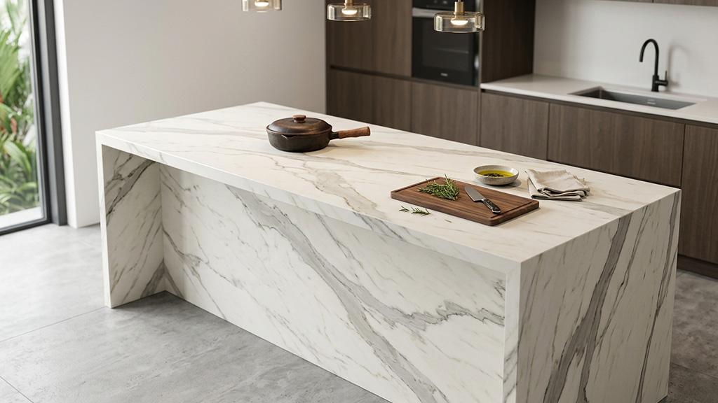
Sintered Stone with Bold Natural-Stone Effects
Large-format sintered stone slabs are available in patterns that replicate the visual character of Calacatta marble, quartzite, dark basalt, and aged concrete, in formats that allow the full slab pattern to be positioned across the island surface without interruption. A sintered stone island surface in a Calacatta-effect pattern, book-matched across the full island top with a waterfall edge extending down both sides, creates a composition with genuine architectural presence.
The practical advantage of sintered stone for a statement island is heat resistance. An island used for food preparation and as a serving surface is the most heavily loaded work surface in the kitchen. Sintered stone handles direct heat contact without discolouration or surface stress, which means trivets are a choice rather than a necessity. It also requires no sealing and resists the acidic contact from Singapore cooking environments without etching. For a surface that will be looked at every day for the next decade, the durability argument matters. You can review the full range of the key benefits sintered stone brings to Singapore kitchens to understand which patterns carry the right level of character for a statement application.
Granite with Distinctive Natural Movement
Natural granite carries movement that no manufactured material fully replicates. The mineral flecks, tonal variation, and crystalline depth in a distinctive granite slab produce a surface character that reads as natural and irreplaceable. On a statement island, this quality is exactly what distinguishes the island from the perimeter countertop when both are stone surfaces.
The selection process for granite on a statement island requires viewing the full slab rather than a sample tile. A quarter-tile sample of a dramatically veined granite tells almost nothing about how that pattern distributes across a 3-metre island surface. Book-matching, the practice of laying two sequential slabs with the mirror image of the grain facing each other, creates a symmetrical pattern across the kitchen island table surface that amplifies the natural movement without increasing the visual chaos. This is a technique that works specifically on islands and large island table surfaces where the full slab width is visible as a continuous plane.
Dark-Toned Stone for High-Contrast Applications
Dark-toned surfaces, ranging from charcoal to deep warm grey and near-black, work on statement islands where the cabinet base is mid-tone or light and the kitchen has enough natural or LED light to prevent the island from reading as a void. The contrast between a dark stone island and lighter perimeter cabinetry is one of the most reliable ways to establish the island as the kitchen’s focal point without introducing pattern movement.
The specification detail that matters most with dark-toned surfaces is finish. A polished dark granite or sintered stone reflects the ceiling, the pendant lights, and whatever is placed on the surface itself. In a Singapore kitchen with LED downlights directly above the island, the reflection activity on a polished dark surface becomes visually busy. A honed dark surface absorbs light and reads as a solid, quiet plane, which is the more controlled expression of the dark-island statement. Exploring which stone surfaces perform best for island table applications in Singapore helps narrow down the dark-toned options to those with the right structural and maintenance profile for high-use kitchen environments.
Relating the Island Surface to the Perimeter Countertop
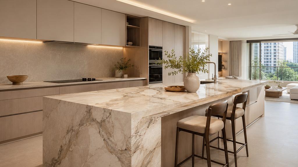
The relationship between the statement kitchen island surface and the perimeter sintered stone, quartz, and porcelain surface options homeowners choose for the surrounding run is the decision that most often determines whether the island statement lands or misfires.
The perimeter countertop does not need to match the island. In fact, a perfect match often removes the contrast that makes the island a statement in the first place. But the two surfaces must share something, whether it’s an undertone, a tonal family, or a material character, that prevents the kitchen from reading as two separate rooms pushed together.
As Houzz Singapore’s guide to kitchen island design notes, if different worktop materials are specified across a kitchen, the difference in thickness should be kept to a maximum of 3mm and surface levels within 2mm of each other, unless a deliberate height change such as a dining bar is being introduced. These practical constraints exist because mismatched surface heights are visible and feel unresolved in a kitchen that is otherwise designed to a high standard.
Four relationships that work reliably:
A bold veined island surface with a quiet, consistent-tone perimeter. The island carries the character. The perimeter provides the ground. The two share a background tone.
A dark island with a light perimeter. High contrast, high visual impact. Works when the rest of the kitchen has enough warmth and detail to hold the composition together.
A surface-of-origin contrast: a dramatic natural granite island with a clean-line quartz perimeter. The materials differ in character but share a tone. The juxtaposition adds layered depth rather than confusion.
A finish contrast: the same stone in polished on the perimeter and honed on the island. The island recedes slightly in reflectivity which gives it a different visual weight from the surrounding run, creating differentiation without colour contrast.
Edge Profile as a Statement Detail
The edge profile on a statement island amplifies or moderates the surface’s visual impact in a way that most renovation guides skip entirely.
A waterfall edge, where the slab material continues vertically down one or both ends of the island to the floor, is the highest-impact edge application. It removes the visual distinction between the horizontal surface and the cabinet beneath, wrapping the island in stone. On a dramatic veined or dark-toned surface, a waterfall edge makes the island read as a monolithic object rather than a piece of furniture with a top. This is a strong statement, but it commits the stone pattern to a highly visible vertical plane. The veining must flow consistently from horizontal to vertical, which requires careful slab selection and precise fabrication.
A standard eased or pencil-round edge keeps the surface as the statement and allows the cabinet work beneath it to play a supporting role. This is the more restrained version of the statement, and it is often the more durable one. The surface does its work, the edge stays out of the way, and the composition reads as disciplined rather than maximalist.
A mitered thick-edge profile, which laminates the stone to create the appearance of a 40 to 60mm thick slab on a thinner substrate, adds weight and solidity to the island impression. It suits dark-toned surfaces and surfaces with bold directional veining better than fine-textured or light-toned stones, where the added thickness reads as heavy rather than substantial.
FAQS

1. What surface makes the best statement kitchen island?
The strongest statement island surfaces are those with clear natural character, whether pattern, tone depth, or both, paired with the right finish for the kitchen’s light conditions and scale. Sintered stone in a bold Calacatta or quartzite effect, distinctive natural granite, and dark-toned honed stone all work well. The right choice depends on the perimeter countertop, the cabinet tone, and the available light in the kitchen.
2. Should the island surface be different from the perimeter countertop?
Not necessarily different, but deliberately chosen in relation to it. A matching surface creates cohesion but reduces the visual distinction that makes the island a statement. A contrasting surface creates impact but requires a shared undertone or tonal relationship to prevent the kitchen reading as disconnected. The most reliable approach is to choose the island surface first and select the perimeter countertop to complement it.
3. Does a statement kitchen island need a waterfall edge?
No. A waterfall edge amplifies the surface statement by extending the stone down the island sides, which is a high-impact but high-commitment application. A standard edge with a well-chosen surface can create a genuine statement without the additional fabrication and material cost of a waterfall. The island’s location in the kitchen and the scale of the space determine whether a waterfall reads as appropriate or excessive.
4. What countertop finishes work best on a statement island in Singapore?
Honed finishes are the most reliable for Singapore kitchens because they add visual depth without the high-glare reflectivity that polished finishes produce under LED downlights. On a bold veined or dark-toned surface, a honed finish moderates the intensity without removing the character. Polished finishes work well when the pattern movement is subtle and the kitchen has ambient rather than direct overhead lighting.
5. Can a small island be a statement island?
Yes, and in compact Singapore kitchens, a smaller island with a genuinely distinctive surface often reads better than a large island with a safe, neutral surface. The statement comes from the surface quality and its relationship to the rest of the kitchen, not from the island’s footprint. A 1.2-metre island with a book-matched granite top in a well-calibrated composition can be more visually compelling than a 2-metre island in a plain quartz.
Conclusion
A statement kitchen island earns its designation through decisions made before any stone is cut. Surface character, finish, tone depth, edge profile, and the relationship to the perimeter countertop are all variables that determine whether the island becomes the considered focal point of the kitchen or an element that simply tries too hard. Getting these right is a calibration process, not a single material choice.
TSD supplies and fabricates stone and sintered stone island surfaces across the full range of characters and finishes relevant to Singapore’s open-plan kitchens. If you’re planning an island and want to understand how your surface choice will read in context, visit the showroom at 16 Joo Koon Circle, call +65 6908 5147, or email tsd.enquiry@gmail.com to arrange an appointment.