Key Takeaways
- The best neutral kitchen ideas work because every surface shares the same undertone, not just the same colour family.
- Undertone (warm: cream, sand, taupe; or cool: grey, slate, blue-white) determines whether countertop, backsplash, and flooring feel like one scheme or three separate decisions.
- Finish type (honed, polished, matte) changes how a neutral surface reads under Singapore’s artificial lighting, sometimes more than the colour itself.
- Sintered stone and quartz are the most practical materials for a cohesive neutral kitchen because they come in large formats, consistent colouring, and multiple finishes.
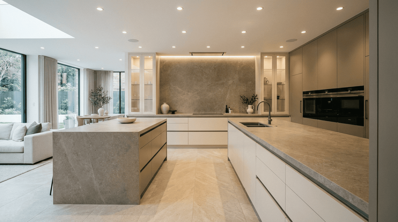
- Treating countertop, backsplash, and floor as one connected tonal system produces a kitchen that holds together over time.
Introduction
White kitchens have dominated renovation conversations for years. Clean, timeless, safe: all reasons that hold up. But the plain white countertop paired with white subway tiles and white walls can read as unresolved rather than intentional. It leaves little room for warmth or character.
The shift happening in Singapore kitchens now is less about colour and more about tonal coordination. Neutral kitchens have moved beyond “what shade of white” into more useful territory. The real question is which neutral temperature, which finish, and how countertop, backsplash, and flooring can be made to read as one connected material decision.
That last question is where most renovations fall short. Not in the colour choice itself, but in treating each surface independently when all three share the same visual plane every day.
What Are Neutral Kitchen Ideas?
Neutral kitchen ideas refer to kitchen design approaches that use surfaces in low-saturation, non-competing tones. Whites, creams, beiges, greiges, taupes, soft greys, and warm stones all qualify.
The term “neutral” does not mean colourless. Every neutral surface carries an undertone: a secondary hue that shifts it toward warm (yellow, red, or orange base) or cool (blue, green, or violet base). That secondary hue determines how the surface reads in the room and whether it works alongside the surfaces around it.
A sand-toned quartz countertop with a warm yellow undertone looks cohesive next to a warm-grey backsplash. Against a cool blue-grey stone floor, it looks off. The colour names suggest harmony. The undertones often don’t deliver it.
Why Undertone Is the Decision That Holds Everything Together
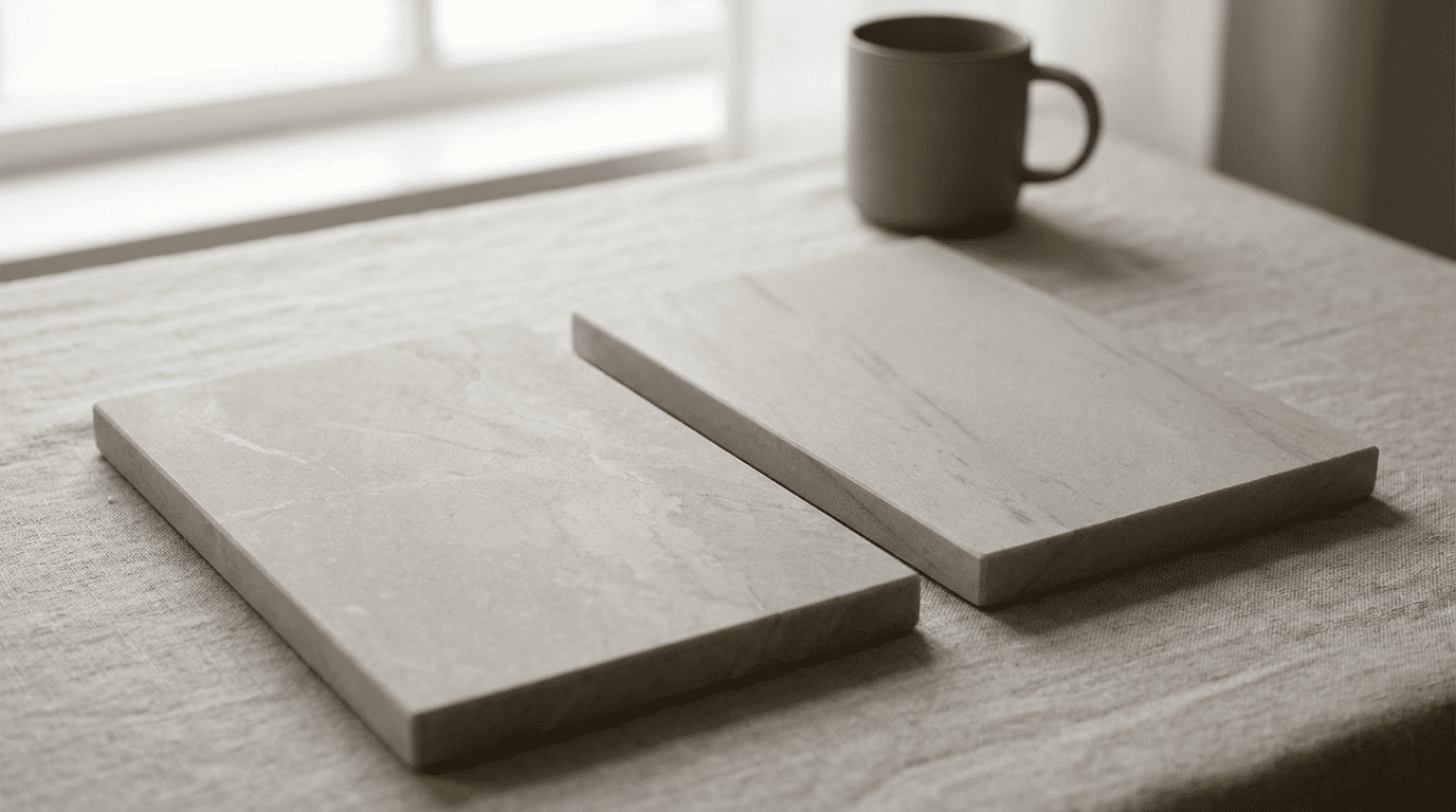
Pick up two stone samples that both read as “greige” in a showroom. Hold them side by side in natural light. One will pull warm, with a hint of yellow or sand beneath the surface grey. The other will pull cool, with a faint blue shifting the tone toward slate. In isolation, both look like neutrals. In the same kitchen, they clash.
This is the core problem with choosing countertop, backsplash, and flooring from different sample sets on different days. Each surface may look right against a white showroom wall. Together in one room, mismatched undertones create a tension that is hard to name but easy to feel.
Design professionals consistently advise choosing one undertone temperature as the dominant tone. The other should be used sparingly, if at all. For Singapore kitchens with limited natural light, a warm undertone across all three surfaces typically produces a more settled result than a cool one.
Undertone is not a design preference. It is the technical reason one neutral kitchen feels resolved and another feels flat, even when both use the same general colour palette.
The practical method: select the countertop slab first, identify whether its undertone runs warm or cool, then use that as the filter for backsplash and flooring samples. Hold all three together in the room under the actual lighting where they will live.
How Finish Type and Surface Choice Affect the Result
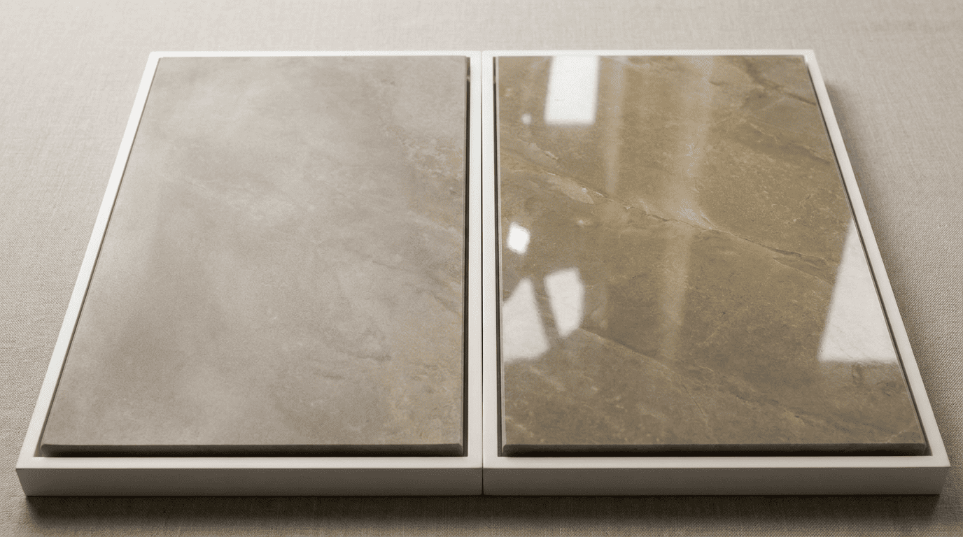
A honed quartz surface and a polished quartz surface from the same slab look like different colours under LED downlights. The polished version reflects the light source directly. It amplifies the base colour and makes veining appear more vivid. The honed version scatters light, softening the colour and reducing contrast.
Most HDB and condo kitchens rely primarily on artificial lighting rather than direct natural light. Under cool-white LEDs (4000K and above), surfaces with warm undertones in polished finishes can look more yellow than expected. Under warm LEDs (below 3000K), those same surfaces deepen and can feel heavy in a compact kitchen.
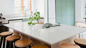
Not every stone surface gives the same flexibility either. Quartz is the most consistent choice for neutral tonal control. As an engineered material, the colour runs through the full thickness of the slab and doesn’t shift across sections. This predictability makes it easier to coordinate with backsplash and floor surfaces. The kitchen countertops that Singapore homeowners choose regularly include quartz for this reason, particularly in compact kitchens.
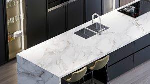
Sintered stone offers the best format flexibility. Available in slabs up to 3,200mm by 1,440mm, it can run from countertop to backsplash as one continuous surface. The colour and pattern are digitally controlled. Finishes come in honed, polished, and matte options. For most Singapore homeowners building a neutral kitchen from scratch, sintered stone or quartz for the countertop and backsplash, paired with a stone-look floor in a coordinated undertone, gives the most control and lowest maintenance.
Matching Countertop, Backsplash, and Flooring as One Tonal System
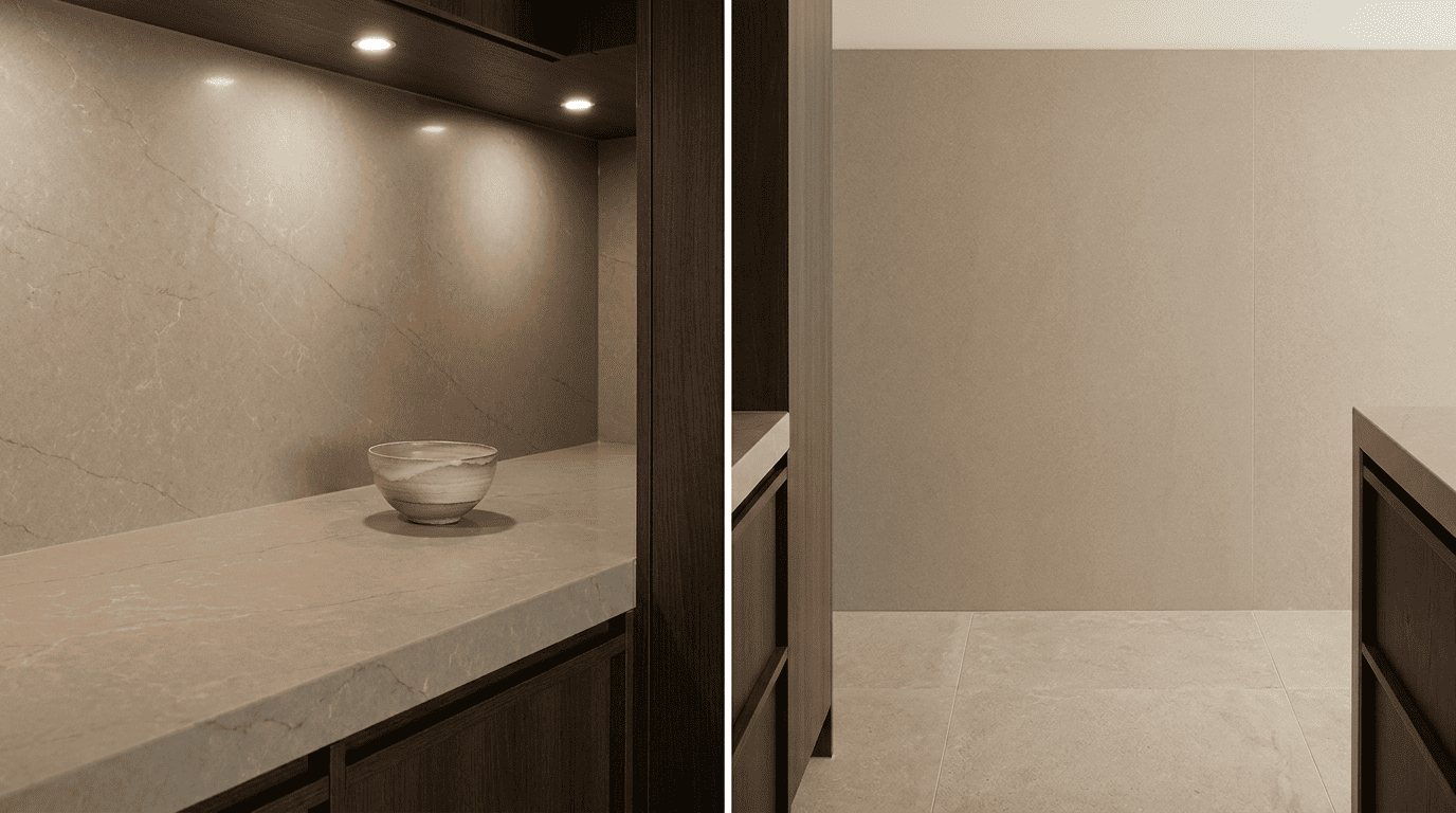
The most common approach in Singapore kitchen renovations is to choose the countertop first, then the backsplash material, then the floor: three separate decisions made weeks apart. The result is surfaces that each look fine individually but don’t hold together as a room.
A more effective method treats all three as one connected decision. Choose samples in the same undertone temperature. Assess finish combinations together. Consider grout colour as part of the system. A warm grey grout reads as part of the surface palette. A white grout creates a grid of contrast that competes with the neutral intention.
Running the same sintered stone material from countertop to backsplash creates visual continuity. It makes a kitchen feel longer and more open. TSD’s guide to kitchen backsplash materials covers how this continuity works in practice. For the floor, match the undertone while stepping the lightness slightly. A lighter stone-look floor under a mid-tone greige countertop gives the room visual ground without competing with the counter surface. TSD’s resource on floor tiles in Singapore covers how material choices connect across rooms.
The kitchen floor, backsplash, and countertop exist in the same field of view every time someone stands in the space. Choosing them together, rather than sequentially, produces better results than treating each as a separate decision.
Does a Neutral Kitchen Work in a Small Singapore Flat?
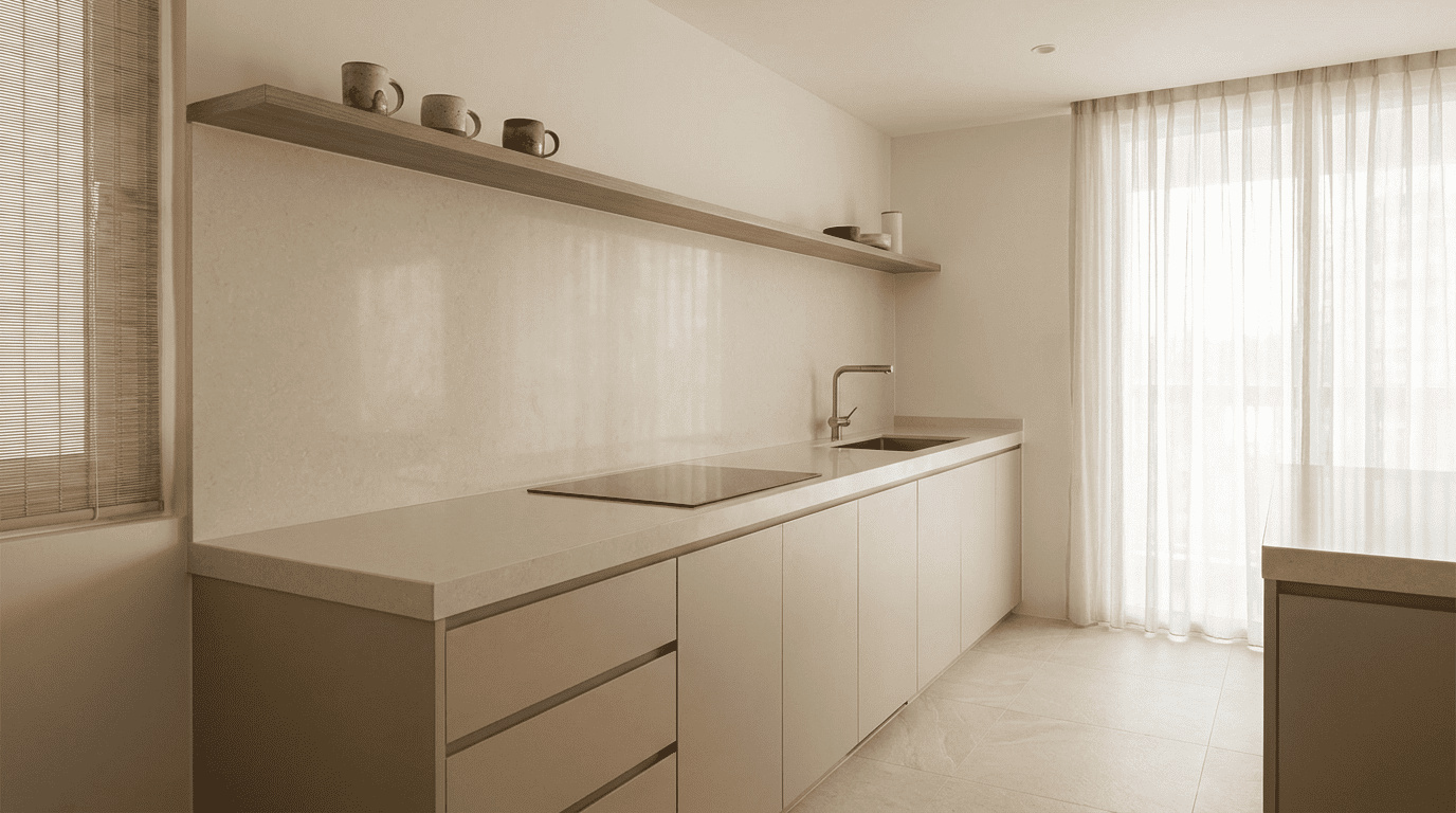
A coordinated neutral palette makes a small kitchen feel more resolved, not more restricted. Several competing surface colours in the same compact space create the opposite effect. A bright white counter, a patterned backsplash tile, and a dark floor tile create three distinct zones of visual attention that a small kitchen can’t absorb.
Lighter neutrals work better than mid-tones in a kitchen under 10 square metres. A soft sand or warm cream reads more open than a deep taupe. Larger format materials with fewer grout lines reduce visual interruptions per square metre. A 1,200mm backsplash panel has no grout lines. A 100mm subway tile grid has one every 100mm.
Finish consistency matters most in compact spaces. Staying within one or two finishes and one undertone temperature produces the settled result a neutral kitchen is meant to deliver.
FAQS
1. What are the best neutral kitchen ideas for Singapore HDB flats?
For HDB kitchens, warm undertones (cream, sand, warm greige) generally outperform cool greys, which can read cold under artificial lighting. Large-format sintered stone backsplash panels reduce grout maintenance. A quartz countertop in a coordinated undertone, paired with a stone-look floor slightly lighter in tone, creates the visual continuity that makes a compact kitchen feel more resolved.
2. How do I use countertop colour ideas to coordinate my whole kitchen?
Countertop colour ideas work best when they start with undertone, not colour name. Identify whether your slab carries a warm or cool undertone, then use that as your filter for backsplash and flooring samples. Hold all three together in the actual kitchen under the daily lighting, not under showroom lights. Avoid mixing warm and cool undertones unless one is an intentional contrast accent you’ve tested in the room.
3. Do stone surfaces look different under LED lighting than in a showroom?
Yes, and the difference can be significant. Polished stone surfaces reflect the colour temperature of the light source directly. Under cool-white LEDs (4000K and above), warm-toned stone can read more yellow or stark than expected. Honed or matte finishes scatter light and produce a more consistent colour under different lighting conditions.
4. Which material is easiest to maintain in a neutral kitchen palette?
Sintered stone and quartz are the lowest maintenance options among the kitchen countertops that Singapore homeowners typically choose. Both are non-porous, require no sealing, and resist staining, heat, and the oils common in local cooking. Natural granite requires periodic sealing but performs well when maintained.
5. Can a neutral palette work in an open-plan Singapore home?
Yes, and the open-plan context makes tonal coordination more important, not less. In an open-plan space, the kitchen surfaces are visible from the living and dining areas. A neutral kitchen palette that shares undertone consistency with the adjoining flooring creates visual continuity across the whole floor plan. Choosing kitchen surfaces without reference to adjacent flooring is where open-plan kitchens often end up looking disconnected.
Conclusion
Neutral kitchens work best when treated as a material system rather than a colour choice. The countertop, backsplash, and floor don’t need to match. They need to share a tonal direction, a finish logic, and enough surface variation to feel considered rather than flat. Getting that right starts with understanding undertone and choosing stone surfaces with the format and consistency to coordinate across all three planes. If you’re planning a kitchen renovation in Singapore, TSD’s full range of surfaces is available at their Singapore showroom across quartz, sintered stone, and granite, with in-house fabrication and installation.