Key Takeaways
- A monochrome kitchen removes colour contrast as a design tool. What prevents flatness is surface variation: finish type, veining, mineral patterning, and slab format.
- Finish is the most direct mechanism. A honed countertop next to a polished backsplash panel in the same tone creates visual separation without any colour difference.
- Veining and organic surface movement do the work that contrasting colours would otherwise do. Stone with movement in the same tonal family adds depth without breaking the scheme.
- Large-format slabs reduce grout lines and extend the visual plane of a single surface. Paradoxically, this makes a monochrome scheme read as more complex, not less.
- Honed or matte sintered stone and quartz are the most practical choices for this scheme in Singapore: both hold a consistent tone, come in large formats, and carry enough surface variation to prevent flatness.
Introduction
A monochrome kitchen is one of the harder briefs to execute well. Restricting the palette to a single colour or tone removes the most common design tool available: colour contrast. In a multi-tone kitchen, the eye moves between surfaces naturally. In a monochrome kitchen, that movement has to come from somewhere else.
For stone surfaces, that somewhere else is surface variation. Finish type, veining density, and slab format are the mechanisms that keep a single-colour scheme from reading as a flat plane. Getting all three working together separates a considered result from one that simply looks empty.
This piece covers each mechanism: why it works and how to apply it when choosing stone for a single-tone kitchen.
What Is a Monochrome Kitchen?
This style of kitchen is built around a single colour or a narrow tonal range, where the palette deliberately avoids strong colour contrast. This doesn’t mean one literal colour. A scheme might span warm white through to cream, or several shades of grey, as long as the overall effect reads as one unified tone rather than distinct contrasting zones.
The challenge is that a single colour applied consistently across multiple surfaces can flatten a room. Without colour contrast, the eye has nowhere to move. The fix is surface variation that substitutes for it.
Why Surfaces Go Flat in a Single-Tone Scheme
Surfaces go flat in a monochrome scheme when every surface shares not just the same colour but the same finish, texture, and scale. A polished grey countertop next to a polished grey backsplash next to polished grey cabinetry produces one large plane with no internal variation. The colour may be correct. The result reads as a single flat wash.
Ideal Home identifies the core principle directly: mixing gloss and matte surfaces prevents a single-tone scheme from feeling stark. When finish changes across surfaces in the same colour, each surface reads as distinct even without any colour difference.
Flatness is a surface-property problem, not a colour problem. Solving it means varying at least one property across the surfaces while holding the colour constant.
In a monochrome scheme, colour contrast is off the table. Finish, veining, and format are the tools that replace it. Getting any one right helps. Getting all three working together is what produces a kitchen with real depth.
Finish Variation: The First Tool Against Flatness
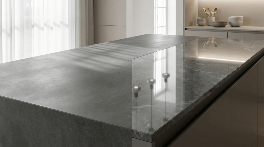
Finish is the most direct and controllable tool in this context. Two surfaces in the same stone and colour read as visually distinct when one is honed, and the other is polished.
A polished finish reflects light directly, making colour appear more saturated and veining more vivid. A honed finish scatters light, producing a quieter, more settled read. A matte or textured finish absorbs light further and carries the most tactile quality of the three. When two of these appear side by side in the same colour, the eye reads them as distinct despite the absence of colour contrast.
The combination that works most reliably in Singapore kitchens is a honed countertop with a polished or slightly textured backsplash in the same material. This is where varying finish produces the most immediate visual result. TSD’s range of sintered stone kitchen countertops includes honed, polished, and matte options across the same colour ranges, making finish variation possible within a single material selection.
Veining and Surface Pattern: How Organic Movement Adds Depth
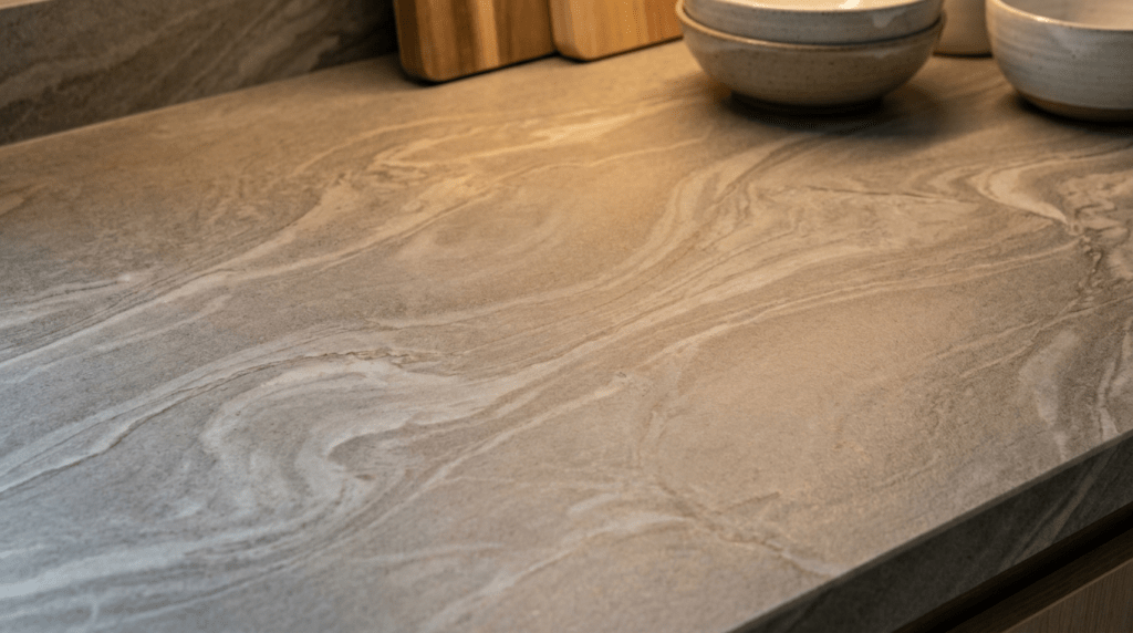
Finish variation changes how light reads across a surface. Veining changes what the eye sees within a surface. In a single-tone scheme, both matter.
A surface with visible veining in the same tonal family as its base colour introduces movement that the eye follows. That movement creates the sense of depth that colour contrast would otherwise provide. A grey countertop with soft white-grey veining reads more visually active than a flat grey countertop with no pattern, even though both sit within the same monochrome range.
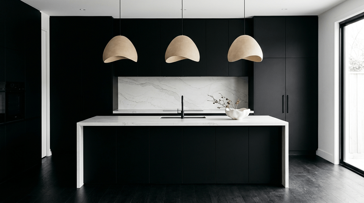
The key is tonal alignment. Veining that contrasts strongly with the base colour introduces colour contrast and breaks the scheme. Veining that sits within the same tonal range adds depth without contradiction. Warm grey with soft white movement, or matte black with dark charcoal patterning, both maintain the monochrome logic while preventing flatness.
Sintered stone in concrete-effect and slate-effect finishes carries this kind of tonal veining by default. TSD’s guide to kitchen backsplash materials covers how surface pattern in sintered stone panels behaves across different kitchen lighting conditions.
Format and Scale: How Slab Size Changes the Surface Read
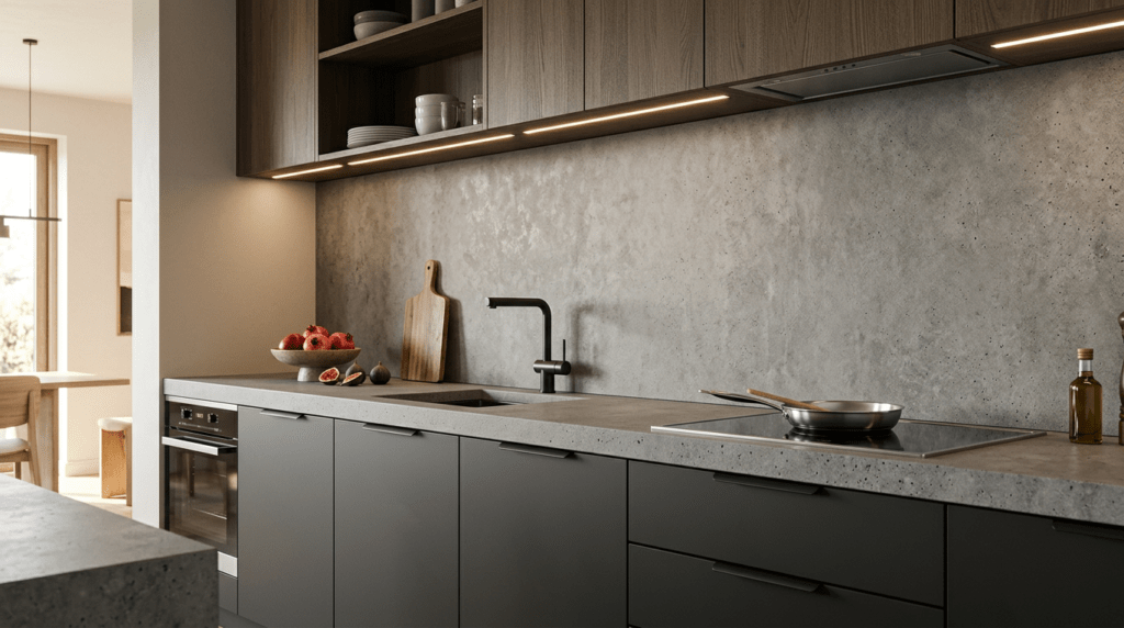
Format is the most overlooked factor in a single-tone kitchen. A large-format slab and a small-tile surface in the same colour read very differently because of what grout lines do to the visual plane.
Small tiles in a monochrome backsplash introduce a grid of grout lines. Each line is a visual interruption: not a different colour, but a texture change and a break in continuity. In a multi-colour kitchen, those lines disappear into surrounding contrast. In a single-tone scheme, they register clearly and can fragment the surface into many small units rather than one cohesive plane.
A large-format sintered stone panel in the same tone eliminates those interruptions. The surface reads as one continuous plane. This has a counterintuitive effect: it makes the scheme read as more deliberate, because the eye takes in the surface’s own variation (its finish, its pattern, its mineral movement) without the distraction of grout lines.
Large-format slabs up to 3,200mm by 1,440mm allow fabricators to produce long countertop runs with minimal visible seams, where the visual result is a continuous surface that reads as one plane rather than sections.
In a single-tone scheme where visual unity is the brief, that continuity is a direct asset rather than an afterthought.
Putting It Together: Surface Selection for a Monochrome Scheme
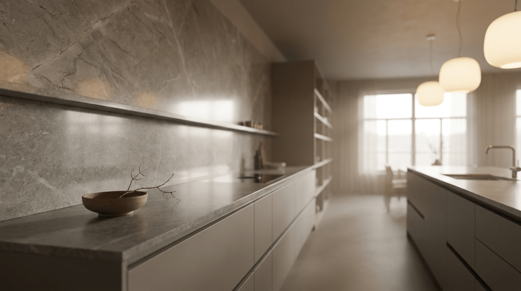
The three mechanisms work best when applied together. A scheme built on all three has more visual depth than one that relies on any single approach.
A practical approach: choose a base stone in the right colour. Select it in two finishes: honed for the countertop, polished or matte for the backsplash. Choose a surface with tonal veining rather than flat colour. Specify large-format slabs for the backsplash to eliminate grout lines and let the material carry the visual weight.
Among the kitchen countertops that Singapore homeowners use for single-tone schemes, sintered stone in grey, charcoal, warm black, and concrete-effect tones is the most flexible. It comes in all three finish types, large-format slabs, and carries tonal surface variation to prevent flatness without breaking the scheme. Quartz in the same colour range is a practical alternative, though it has fewer finish options and is not heat-resistant. TSD’s full range of kitchen countertops Singapore homeowners choose for single-tone applications covers both materials across a range of tones and finishes.
FAQS
1. Why do surfaces look flat in a single-tone kitchen scheme?
Surfaces go flat when every surface shares the same finish, texture, and scale in addition to the same colour. Without variation in any of those properties, the eye has no point of distinction. The fix is to vary finish, veining, or slab format while keeping the colour constant.
2. Which countertop finishes work best for a single-tone scheme?
Two countertop finishes within the same colour are more effective than one used consistently. A honed countertop paired with a polished or matte backsplash panel in the same stone tone creates visual separation without colour contrast. Honed sintered stone is the most practical starting point: it holds colour consistently and pairs well with both polished and matte backsplash surfaces.
3. Does veining break a monochrome scheme?
Not if the veining sits within the same tonal range as the base colour. Veining that is slightly lighter or darker, but in the same colour family, adds depth without contradiction. Strong contrasting veining in a different colour introduces colour contrast and breaks the scheme. Sintered stone and quartz in concrete-effect and slate-effect finishes carry tonal veining that adds movement without disruption.
4. What is the best stone for a single-tone kitchen in Singapore?
Honed or matte sintered stone is the most reliable choice. It holds consistent colour across the full slab, comes in large formats, and carries enough tonal surface variation to prevent flatness. It handles Singapore’s heat, humidity, and cooking conditions without sealing or special maintenance.
5. How does slab format affect a single-tone kitchen scheme?
Large-format slabs eliminate grout lines, removing visual fragmentation from the surface plane. In a single-tone scheme where every detail registers without colour contrast to distract, that continuity matters. A large-format sintered stone backsplash in the same tone as the countertop reads as one cohesive surface, letting the material’s finish and pattern carry the visual interest.
Conclusion
This kitchen style doesn’t call for colour. It asks for surface intelligence. The difference between a flat scheme and a considered one comes down to whether finish, pattern, and format are doing the work that colour contrast normally handles. Stone surfaces are well-suited to this task because they exhibit all three properties in a single material. If you’re planning a single-tone kitchen in Singapore, TSD’s showroom is the right place to see sintered stone and quartz finishes under real lighting conditions before committing to a scheme. Browse our full range on the product page.