Key Takeaways
- The right countertop colour idea is not the one that looks best in isolation. It’s the one that works best with your cabinet tone, your kitchen’s light conditions, and how the kitchen is used daily.
- Cream reads warm, softens dark cabinets, and suits Singapore kitchens with limited natural light. It shows daily cooking marks more readily than grey or taupe.
- Taupe sits between cream and grey and is the most flexible of the three. It carries a warm undertone while reading as contemporary, which suits a wide range of cabinet colours and design directions.
- Cool grey has narrowed in design relevance in 2026 as earthy and warm palettes have become dominant. Warm grey, with a sand or stone cast rather than a blue cast, remains a strong and versatile choice.
- No countertop colour decision should be finalised from a sample tile in a showroom. Viewing a full slab in your kitchen’s actual lighting conditions is the only reliable way to confirm the tone works.
Introduction
Three colours dominate the neutral countertop conversation for Singapore kitchens. Cream is the warmer option. Grey is the cooler one. Taupe sits between them and carries a bit of both. Most homeowners looking for countertop colour ideas will have considered all three at some point during a renovation, and many end up choosing based on which slab looked best in the showroom or which sample seemed least risky.
That approach produces satisfactory results some of the time. It also produces a fair number of kitchens where the countertop looks slightly wrong in daily life without anyone being able to explain why. The tone was fine on the sample. It changed under the kitchen’s actual lighting. Or it looked right until the cabinets were installed, and then the undertones fought each other.
This blog maps the three colour families to the specific kitchen conditions in which each performs best. Cabinet tone, light quality, kitchen scale, and cooking habits all influence which choice holds up over ten years of daily use. Getting that mapping right at the selection stage is what separates a countertop colour decision you stop thinking about from one you keep second-guessing.
What Is a Countertop Colour Idea?
A countertop colour idea refers to the selection of a surface tone for a kitchen countertop, whether in stone, engineered stone, sintered stone, or other materials, to achieve a specific visual and practical result in the kitchen. The decision involves more than tone alone. Surface finish, veining character, and background depth all modify how a colour reads in daily conditions. Two slabs described as “warm white” by different manufacturers can look noticeably different once installed in the same kitchen because the undertone, the veining distribution, and the finish type each shift the reading of the surface.
Why Undertone Matters More Than the Colour Name
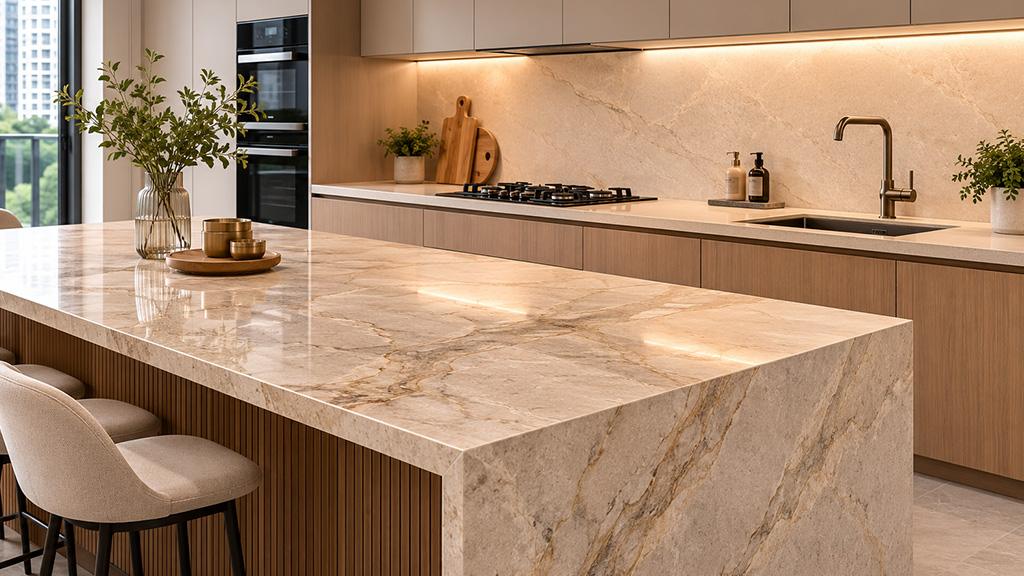
The most common mistake in countertop colour selection is evaluating the headline colour rather than the undertone. A cream countertop with a yellow-dominant undertone behaves differently in a Singapore kitchen from a cream countertop with a pink or ivory undertone. A grey countertop with a blue cast reads as cold and clinical. A grey countertop with a sand or stone cast reads as architectural and grounded.
As Houzz Singapore’s guide to countertop colour selection explains, soft grey countertops and mid-tone shades, including beiges and rich creams, are the most neutral counter options. In kitchens with creamy off-white cabinets and warm undertones in the backsplash or wood flooring, creamy counter tones add a harmonious, peaceful look that works because the undertones align. When the undertones conflict, the kitchen reads as unresolved regardless of how individually appealing each element is.
Confirming the undertone of a countertop requires viewing it against your actual cabinet colour, under your kitchen’s installed lighting. A sample tile viewed on a white counter in a brightly lit showroom will read differently from the same stone installed in a Singapore HDB kitchen with warm LED downlights and a timber-veneer cabinet base. This is not a failure of imagination. It’s a property of how surfaces interact with each other and with light.
Cream Countertops: When They Work and When They Don’t
When cream works
Cream is the warmest of the three colour families. It brings a softening quality to kitchens with darker or cooler cabinet colours, and it adds visual warmth to spaces with limited natural light. Many Singapore condo kitchens face inward or receive limited daylight through small windows, and a cream countertop reflects what ambient light exists while contributing a sense of warmth that grey and even taupe cannot.
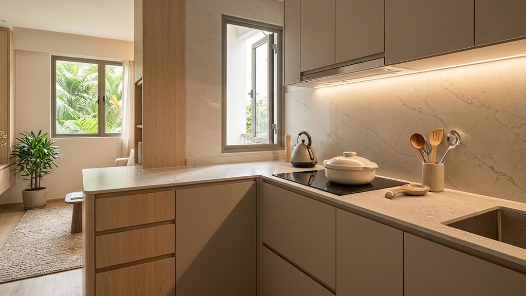
Cream works best against oak, warm timber veneer, and sage or olive cabinet colours. It also works well against off-white or cream cabinets, where the shared undertone creates a tone-on-tone depth rather than a jarring contrast. In a compact Singapore kitchen where the countertop and cabinets are both cream-adjacent, the effect is a continuous warm plane that makes the space feel larger and more settled than a mixed-tone composition would.
White and cream quartz table top surfaces in the Ivory White family are particularly suited to Singapore’s HDB kitchens for this reason. The warm cream background reflects ambient LED light without producing the stark reflectivity of a pure white surface, and the tone integrates comfortably with the warm timber and laminate cabinet colours that dominate local renovation specifications.
When cream doesn’t work
Cream works against the kitchen when the cabinet colour already carries strong warmth and the two warm tones compete rather than harmonise. A honey-toned timber cabinet with a yellow-cast cream countertop produces a visual result that reads as yellowed rather than warm. In this situation, moving the countertop toward taupe or a cool white resolves the tension.
Cream also shows daily cooking residue more readily than grey or taupe. Turmeric, oils, and dark sauces leave visible marks on light cream surfaces that require immediate cleaning. For Singapore families who cook with strong-coloured spices and sauces daily, a cream countertop demands consistent maintenance to stay looking clean. This is not a reason to avoid cream entirely, but it is a practical condition worth factoring in alongside the visual preference.
Taupe Countertops: The Most Versatile of the Three
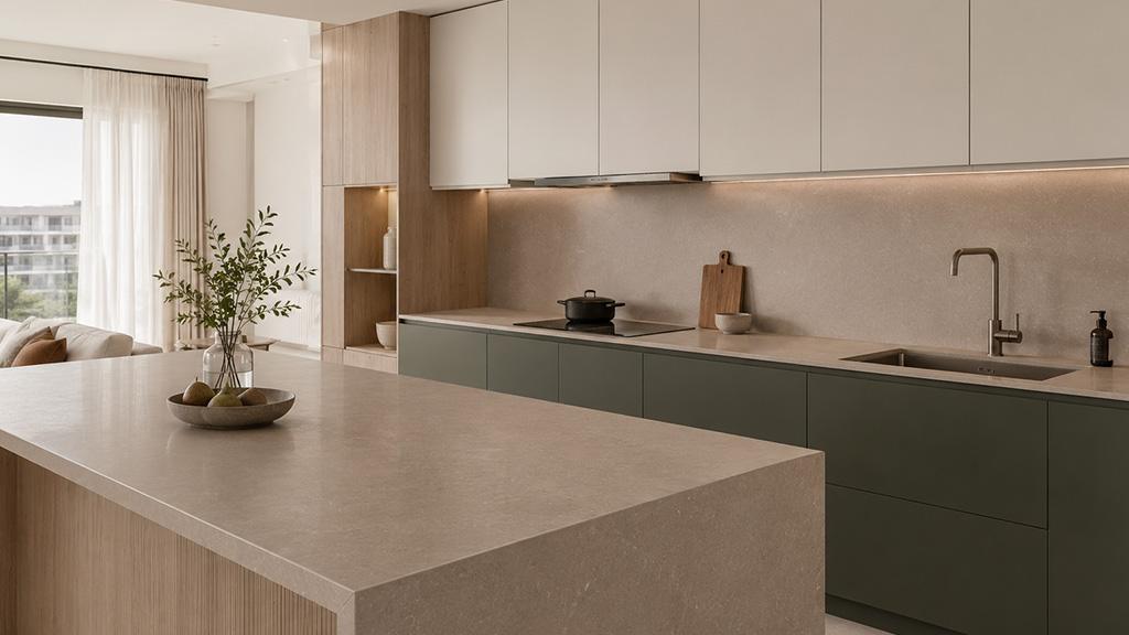
Taupe occupies the position that makes it, in most kitchen colour scenarios, the lowest-risk choice of the three. It carries a warm undertone that prevents it from reading as cold, while its grey component keeps it contemporary rather than traditional. It sits comfortably beside a wider range of cabinet colours than either cream or grey because it reads as a bridge tone rather than a committed warm or cool statement.
“Soft grey countertops and other mid-tone shades, such as beiges or rich creams, are the most neutral counter options. They have the advantage of hiding the occasional spot while still looking clean and tidy and not too dark or busy.” (Houzz Singapore, Choosing the Colour of Your Kitchen Countertop)
Taupe performs well against white and off-white cabinets, where it adds warmth without pulling the scheme toward cream. It also works against mid-grey cabinets, where the warm undertone prevents the composition from reading as cold. Against deep green or navy lower cabinets in a two-tone kitchen, taupe reads as the grounding neutral that holds the composition without competing with the cabinet colour.
For homeowners who want a countertop colour that holds its relevance across changing design directions, taupe is the most durable choice for quality kitchen countertops. The earthy and warm palette shift that has dominated 2025 and 2026 design cycles works in taupe’s favour: the colour sits at the intersection of earth-tone warmth and contemporary restraint, which means it integrates naturally into current kitchen directions and will continue to do so as those directions evolve.
Taupe also hides daily cooking marks better than cream. The mid-tone depth absorbs minor surface residue without making it as visible as it would be on a lighter cream surface. It does not hide marks as effectively as a dark grey, but for most Singapore kitchens where the countertop is cleaned at the end of each cooking session, taupe requires less immediate attention than cream.
Grey Countertops: The Undertone Distinction That Changes Everything
Grey is not a single countertop colour. It is a family of tones that span from blue-based slates that read as cold and clinical, to warm sandy greys that read as architectural and grounded, to charcoal tones that read as sophisticated and dramatic. The countertop colour idea that works depends entirely on which end of that spectrum is being specified, and which cabinet and light conditions it’s being specified for.
Cool grey
Cool grey, particularly the icy and blue-leaning greys that dominated Singapore kitchen design for much of the 2010s, has narrowed significantly in design relevance. As Ideal Home’s grey kitchen design guide notes, tone is important within the grey family, and warmer greys create an entirely different feel from blue-based shades of slate. Cool grey countertops specified in kitchens during 2020 to 2023 are now one of the most common renovation regrets as the design cycle has shifted toward warmer palettes. For homeowners renovating now and planning to stay in the kitchen for ten or more years, cool grey carries significant design-cycle risk.
Cool grey countertops still work in specific contexts: contemporary kitchens with polished concrete floors, metallic hardware, and a deliberate industrial direction. In those compositions, the cool tone is coherent because the entire palette is cool. The problem arises when cool grey is specified because it seems safe, rather than because the kitchen’s conditions actually call for it.
Warm grey
Warm grey, with a sand, stone, or brown cast rather than a blue cast, is a different proposition. It integrates with the earthy and natural material palette that now dominates Singapore’s renovation landscape, works beside timber cabinet veneers and warm white walls, and reads as considered rather than safe. A sintered stone countertop in a warm grey tone, in a honed or matte finish, suits Japandi-influenced kitchens, contemporary minimalist kitchens, and transitional kitchen schemes where the homeowner wants a neutral that doesn’t read as trend-dependent.
As to why natural stone remains a strong choice for Singapore kitchens, warm grey in sintered stone is one of the most practical colour specifications. The tone hides daily cooking marks effectively, works with the widest range of cabinet colours of any grey variant, and does not carry the design-cycle risk of cool grey. The practical advantage of sintered stone in this colour family is heat resistance, which matters specifically for warm grey specifications on surfaces beside gas hobs, where repeated heat cycles would risk discolouration in resin-bound materials.
Dark grey
Dark grey or charcoal countertops occupy a different design role from the two lighter grey variants. A dark grey countertop is not a neutral backdrop choice. It is a design statement that establishes the countertop as a visual anchor in the kitchen. It works best when the kitchen has enough natural or artificial light to prevent the surface from reading as a void, and when the surrounding elements, cabinets, hardware, and flooring, have been chosen to carry the weight of that anchor rather than fight against it.
How Singapore Kitchen Conditions Affect the Decision
Light quality
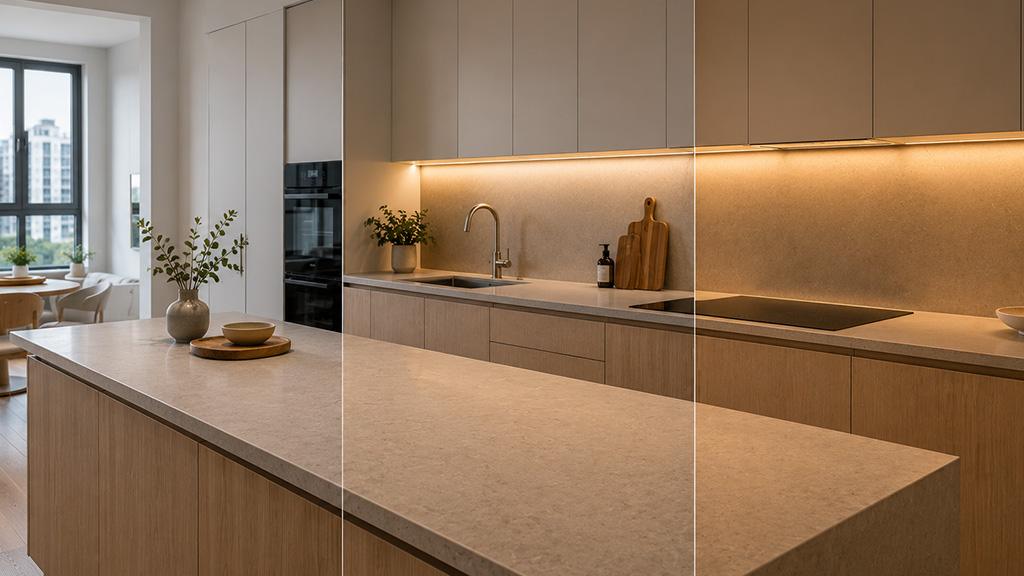
Singapore kitchens in HDB flats and condos frequently receive warm LED lighting rather than natural daylight as their primary light source. Warm LED light reads differently on cream, taupe, and grey surfaces. It intensifies the cream’s warmth, which can shift a cream countertop toward yellow under some bulb temperatures. It softens taupe and brings out its warm component, which typically flatters the tone. It warms a cool grey slightly, which can help, but does not fully resolve the undertone conflict if the grey’s blue cast is strong.
If your kitchen receives significant natural daylight through east- or west-facing windows, the same surface will look different at different times of day. A cool grey that looks reasonable under warm LED evening lighting may read as cold and blue in morning natural light. This is a viewing-condition consideration that no showroom sample can replicate.
Kitchen scale
In compact Singapore kitchens, lighter tones on the countertop contribute to an open, spacious reading of the space. Cream and light taupe reflect more light than grey and make the horizontal plane of the countertop less visually prominent, which helps small kitchens feel less closed. Dark grey countertops in compact kitchens absorb light and can make the kitchen feel smaller unless the rest of the design compensates with reflective surfaces elsewhere.
In larger kitchens or those with good natural light, all three colour families perform well. The scale gives the countertop enough context to carry even a dark tone without the kitchen feeling oppressive.
Cabinet colour
The cabinet colour determines more than any other factor whether cream, taupe, or grey reads correctly as a countertop tone. The relationship between countertop and cabinet is the most visible pairing in any kitchen, visible from the entry, from the living zone, and from across the table. Getting the undertone relationship right between these two elements is what separates a kitchen that reads as cohesive from one that doesn’t.
White cabinets: all three tones work. Cream adds warmth. Taupe adds a mid-tone bridge. Cool grey adds crisp contrast. Warm grey adds architectural depth.
Timber or oak veneer cabinets: cream and taupe work best because they share the warm family undertone. Cool grey conflicts with timber warmth. Warm grey can work if the grey is distinctly sandy rather than blue-inflected.
Dark or coloured cabinets: taupe and warm grey are the most reliable choices because they read as a grounding neutral rather than a competing tone. Cream can work against deep green or sage but risks looking washed-out against very dark cabinets.
A Practical Colour-Matching Sequence
Bring the cabinet door sample to the stone showroom, not the other way around. View the countertop slab against the actual cabinet sample under natural or neutral light, not under warm showroom spotlights. Identify the undertone in both surfaces. Ask whether they share a warm or cool cast. If one is warm and one is cool, note the conflict before committing.
This practical countertop colour idea sequence, cabinet first, then slab, then light-condition testing, prevents the most common mistake in colour selection: choosing a tone that looks right in isolation and wrong in context.
Request a large slab cut sample rather than a small tile. A 300 by 300mm tile cannot show how veining distributes across 2.5 metres of countertop, and it cannot show you whether the tone holds consistently or shifts in different lighting conditions. A full slab viewed in your kitchen confirms both. For quartz table top surfaces in cream and warm white families, the visual consistency across the full slab is generally high, which simplifies the evaluation. For natural stone surfaces in taupe or grey families, where batch variation can be significant, viewing the specific slabs destined for your kitchen is even more important.
FAQS

1. Which countertop colour is most popular for Singapore kitchens in 2026?
Warm neutral tones, including taupe, warm white, and warm grey, are the dominant countertop colour ideas in Singapore kitchen renovations in 2026. The design shift away from cool greys and stark whites toward earthy and warm palettes has made these tones the most common specification in both new condo launches and renovation projects. For homeowners seeking a countertop colour idea that aligns with current kitchen design Singapore trends while remaining relevant for a decade, taupe and warm grey are the most reliable starting points.
2. Does a cream or grey countertop hide marks better?
Grey hides daily cooking marks more effectively than cream. The mid-tone depth of grey surfaces absorbs minor residue without making it visually prominent, whereas cream surfaces show turmeric, oils, and dark sauces immediately. Taupe sits between the two and is a practical compromise for households that cook with strong-coloured ingredients daily.
3. Will grey countertops look outdated?
Cool blue-grey countertops carry a significant risk of reading as dated in 2026 and beyond. Warm grey countertops, with a sand or stone undertone rather than a blue cast, remain a strong and forward-compatible choice. The distinction between cool grey and warm grey is the most important decision for homeowners specifying grey countertops now.
4. Can I use cream countertops with dark cabinets?
Yes, and cream can work well against dark cabinets by providing contrast and lightening the visual weight of the lower cabinet zone. The condition is that the cream’s undertone must not conflict with the cabinet’s undertone. A cream with a yellow cast against a dark navy cabinet will read as incongruent. A warm ivory cream against a deep green cabinet that shares a warm undertone reads as considered and grounded.
5. What countertop colour works in a small Singapore kitchen?
Cream and light taupe are the most practical countertop colour ideas for compact Singapore kitchens. Both reflect ambient light and keep the horizontal plane of the countertop visually light, which contributes to a sense of space. Dark grey in compact kitchens absorbs light and should be paired with reflective surfaces elsewhere in the kitchen to prevent the space from feeling smaller.
Conclusion
Cream, taupe, and grey are all sound countertop colour choices in the right kitchen conditions. The decision that holds up well for a decade is the one made with the actual kitchen in mind: its light quality, its cabinet tone, its scale, and how it gets used every day. Getting that mapping right at the selection stage, rather than defaulting to what looks best in a showroom, is the most reliable path to a countertop colour you stop thinking about.
TSD supplies stone, quartz, and sintered stone surfaces across all three colour families and their full range of undertone expressions. If you want to view full slab samples in your kitchen’s actual conditions, visit the showroom at 16 Joo Koon Circle, call +65 6908 5147, or email tsd.enquiry@gmail.com to arrange an appointment.