Key Takeaways
- A soft minimalist kitchen is defined by warmth, not emptiness. Cream, warm greige, sandy taupe, and muted sage sit at the centre of the palette; cold white and stark grey work against it.
- The countertop is the most exposed horizontal surface in the room and sets the visual tone for the whole space. A surface that is too glossy, too pattern-heavy, or too cool in undertone disrupts the look even when every other element is right.
- Honed and matte finishes are the default for soft minimalism because they absorb light rather than reflect it, producing the quiet surface quality the style depends on.
- Undertone is the decision beneath the colour decision. A countertop with a warm sand undertone settles into the palette; one with a cool blue-grey undertone sits apart from it, regardless of how similar both look in a showroom.
- Stone-look sintered stone in a warm concrete or marble-effect finish gives this aesthetic the organic texture it needs without the sealing and etching maintenance that natural marble requires in Singapore’s conditions.
Introduction
Hard minimalism is easy to recognise: white on white, handle-less cabinets, surfaces that look untouched. Soft minimalism is a different brief. The goal is warmth rather than severity, calm rather than clinical. The palette runs toward cream and warm stone rather than stark white. Surfaces carry subtle organic texture rather than high-gloss uniformity.
In this style of kitchen, every surface either supports that warmth or disrupts it. Cabinets and hardware attract most of the attention in renovation content, but the countertop is doing more visible work than either. As Real Homes notes, choosing a honed stone surface with the right tone lets the calm of the room breathe, while the wrong material pulls focus in a way that contradicts the aesthetic.
What Is a Soft Minimalist Kitchen?
This style of kitchen uses reduced visual complexity alongside warm, organic materials and a muted, nature-adjacent palette. It’s distinct from hard minimalism, which prioritises cool geometry and stark neutrals. Soft minimalism sits between both: structured but not cold, simple but not stark.
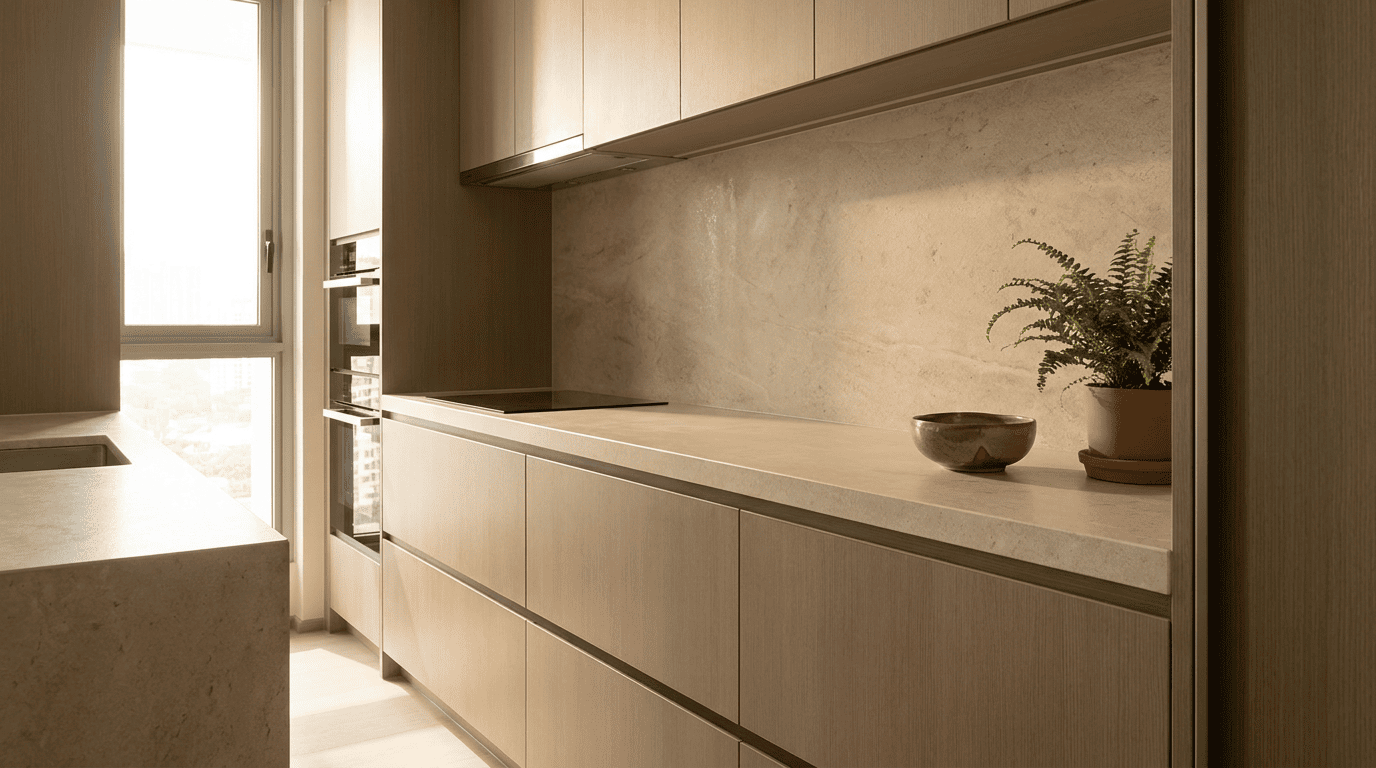
The defining properties are warmth in colour temperature (cream, linen, warm greige, dusty sage), organic texture in surface materials (stone, wood, matte ceramics), and low visual noise across every horizontal plane.
Why the Countertop Is the Surface That Defines the Whole Look
In this aesthetic, cabinet doors are deliberately understated. A handle-less cabinet in warm cream or natural oak recedes rather than demands attention. The countertop doesn’t have that option. It sits at standing height, runs the full length of the kitchen, and sits directly beneath the lighting. It’s always in the foreground.
The countertop is also where light lands first. Pendant lighting, recessed downlights, and natural light all hit the counter before reaching anything else. Its reflectivity and colour temperature are more visible than those of the cabinets, which sit partially in shadow.
The countertop sits where light lands first. In this aesthetic, that surface needs to absorb the room’s light quietly rather than announce it.
The Finish Decision: Why Honed and Matte Work, Polished Doesn’t
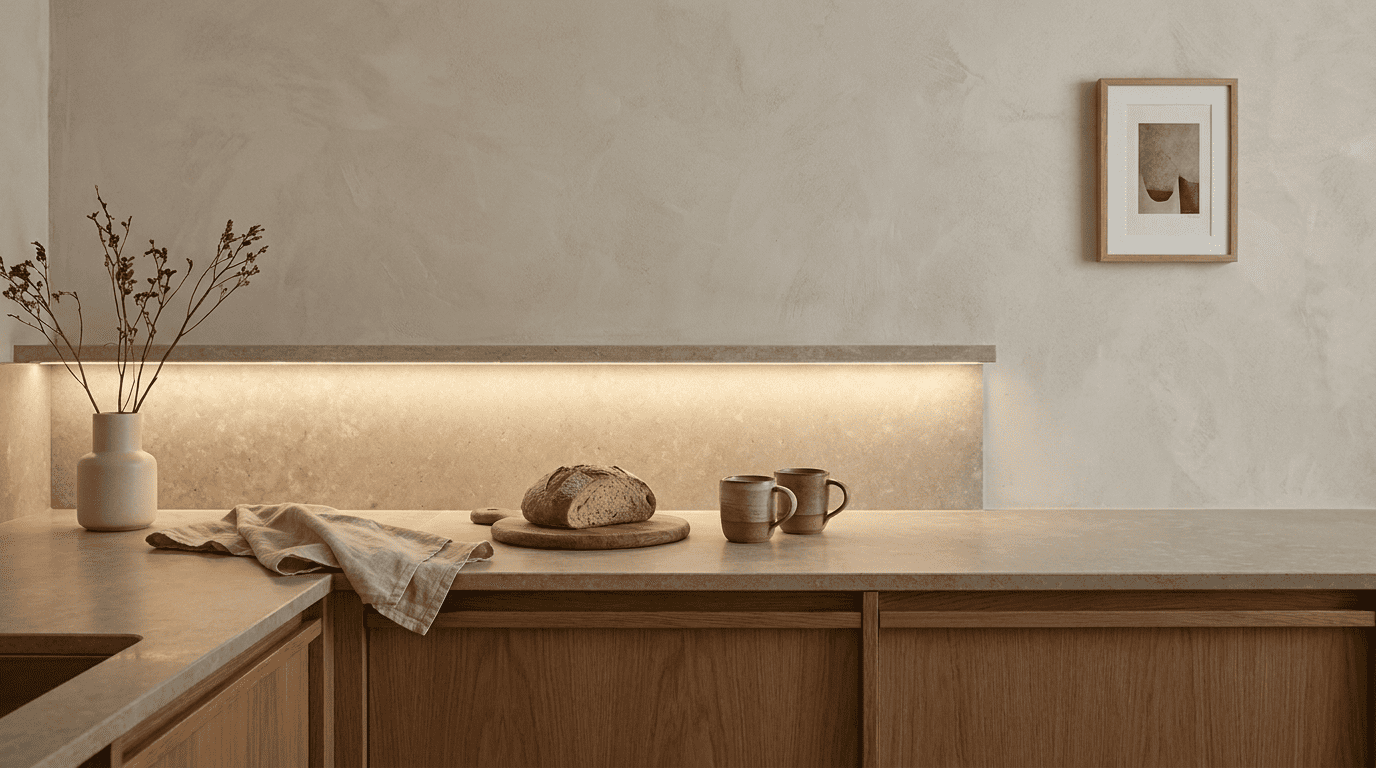
Finish is the single most consequential countertop decision for this look, ahead of material and ahead of colour. It determines whether the surface absorbs or reflects the room’s light.
A polished finish amplifies the surface’s colour, sharpens its veining, and reflects light sources directly. Under kitchen downlights, it produces bright spots of reflected light along the counter’s length. In this look, the countertop should recede rather than dominate. A polished finish does the opposite.
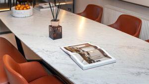
A honed finish is smooth without shine. Light scatters across it rather than reflecting in concentrated points. Colour reads slightly softer and more muted than the same slab in polished form. Honed is the practical sweet spot: it delivers the surface calm the aesthetic requires while remaining easy to clean in daily use.
A matte finish produces a fully flat, slightly tactile surface and is the warmest of the three. The practical note: fully matte natural stone holds residue more readily than honed. For a low-maintenance result, honed sintered stone or honed quartz are more reliable in a working Singapore kitchen.
TSD’s overview of kitchen countertops in Singapore covers how these countertop finishes interact with different materials and kitchen use patterns in local homes.
Colour and Undertone: The Palette Decision Beneath the Palette
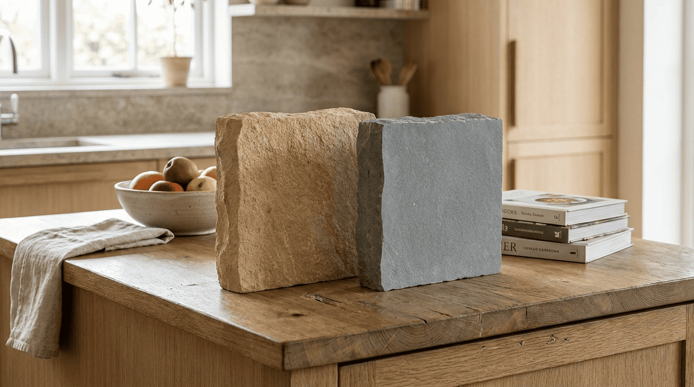
The palette of a soft minimalist kitchen runs warm. Cream, warm greige, linen, sandy taupe, and dusty sage deliver the calm the style aims for. Cool greys, blue-whites, and stark whites read as clinical and work against it.
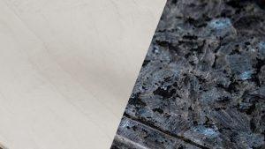
What the colour name doesn’t tell you is the undertone: the secondary hue beneath the surface colour that shifts a slab toward warm (yellow or sand base) or cool (blue or grey base). Two slabs described as “greige” in a sample catalogue can behave very differently in the same room. One settles into the palette. The other sits slightly apart from everything around it.
Under warm LED downlighting, common in Singapore HDB and condo kitchens, this difference is more visible than it appears in a showroom. Identify the undertone direction of the cabinetry and flooring first, then select a countertop slab that carries the same temperature. Hold all three together under the kitchen’s daily lighting before committing.
Colour names describe what a surface looks like in isolation. Undertone determines what it does in a room. Getting the undertone consistent across countertop, cabinet, and floor is the decision that holds a soft minimalist palette together.
Which Materials Deliver the Right Surface Quality
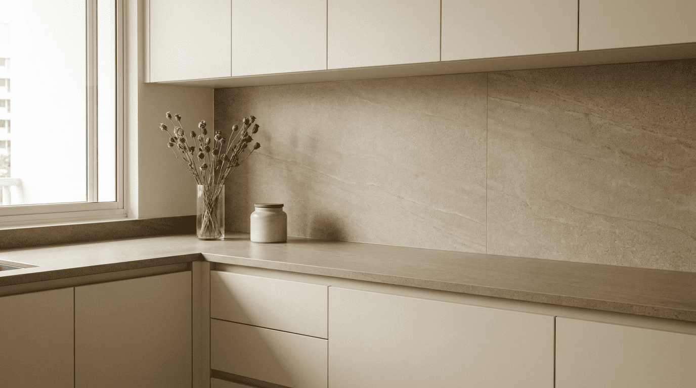
Sintered stone is the most reliable choice for this aesthetic. It comes in large-format slabs, is available in honed and matte finishes, and its warm concrete-effect and marble-effect patterns carry enough organic movement to read as intentional rather than flat. It’s non-porous and requires no sealing, which means the surface stays consistent in colour and finish over years of daily use. TSD’s guide to stone-look surfaces for Singapore interiors covers how modern sintered stone achieves the depth of warm-toned finishes in local conditions.
Quartz in a warm-toned honed finish is a practical alternative. It’s non-porous, available in soft neutral colours, and predictable to coordinate with other surfaces. It requires trivets near the hob as it’s not heat-resistant.
Natural marble and granite carry organic variation that no engineered surface can fully replicate. The trade-off in Singapore is real: marble etches on contact with acidic cooking liquids, and granite requires periodic sealing to resist oils. TSD’s guide to sintered stone countertops covers how engineered surfaces compare in Singapore’s conditions.
What a Wrong Countertop Choice Actually Does to the Look
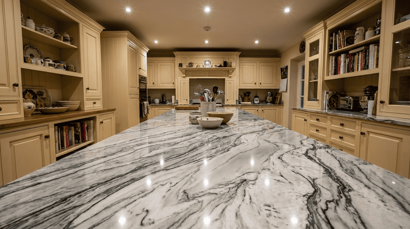
A polished countertop in a cool-toned stone draws the eye every time light hits it. In a room designed to feel still, that reflected movement works against the brief at the most prominent level. The cabinetry, flooring, and hardware can all be right, and the polished countertop will still pull the room toward hard minimalism or busy contrast.
A cool-undertone countertop in a honed finish is subtler but still disruptive. The kitchen might feel almost right without the homeowner being able to name why. The colour looks close. The finish is appropriate. But the undertone creates a slight visual separation between the countertop and the warmer tones around it.
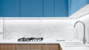
A pattern-heavy countertop (dramatic veining, strong contrast between background and veining colour) introduces visual noise at exactly the wrong level. A countertop with bold pattern movement becomes the focal point of the room, which works against the whole logic of keeping surfaces quiet enough that the space itself is what you notice.
The countertop is not a background element in a soft minimalist kitchen. It’s the surface that either validates or contradicts every other decision in the room.
FAQS
1. How would you define the soft minimalist style in a kitchen?
Soft minimalism in a kitchen combines reduced visual complexity with warm, organic materials and a muted, nature-adjacent palette. It prioritises warmth over clinical coolness. The palette runs toward cream, warm greige, and dusty sage. Materials introduce subtle organic texture rather than uniform flatness. The result is calm without being stark.
2. Which countertop finishes suit this aesthetic best?
Honed and matte finishes work best because they absorb light rather than reflect it, keeping the countertop from drawing attention to itself. Polished finishes produce exactly the visual prominence this look is designed to avoid. For kitchen design Singapore homeowners planning this kind of renovation, honed sintered stone in a warm neutral tone is the most practical choice.
3. How important is undertone when choosing a countertop colour?
Undertone is often more important than the named colour. Two slabs described as the same neutral can behave very differently depending on whether their secondary hue runs warm or cool. In this palette, a countertop with a cool blue-grey undertone will sit apart from warm cabinetry regardless of how similar the colours look in a showroom.
4. Can stone-look surfaces deliver the quality this aesthetic needs?
Yes. Modern sintered stone in stone-look finishes is produced using high-resolution digital printing layered with surface texturing, and in a finished kitchen the visual result is very close to natural stone. For kitchen design in Singapore conditions specifically, stone-look sintered stone doesn’t etch, doesn’t stain from acidic cooking ingredients, and requires no sealing.
5. What countertop mistakes most commonly undermine this aesthetic?
Three mistakes appear regularly. First, a polished finish, which creates reflected light that contradicts the calm the style requires. Second, a cool-undertone slab that sits apart from the warm palette surrounding it. Third, a pattern with strong contrast or dramatic veining that makes the countertop the focal point of the room rather than a quiet participant in it.
Conclusion
Getting the countertop right in this style of kitchen is less about finding the right colour name and more about understanding how finish, undertone, and pattern work together under daily light. If you’re planning a kitchen renovation in Singapore and want to compare honed sintered stone and quartz options across warm neutral tones, TSD’s full range is available at their Singapore showroom, with in-house fabrication and installation handled end-to-end.